view the rest of the comments
Technology
This is the official technology community of Lemmy.ml for all news related to creation and use of technology, and to facilitate civil, meaningful discussion around it.
Ask in DM before posting product reviews or ads. All such posts otherwise are subject to removal.
Rules:
1: All Lemmy rules apply
2: Do not post low effort posts
3: NEVER post naziped*gore stuff
4: Always post article URLs or their archived version URLs as sources, NOT screenshots. Help the blind users.
5: personal rants of Big Tech CEOs like Elon Musk are unwelcome (does not include posts about their companies affecting wide range of people)
6: no advertisement posts unless verified as legitimate and non-exploitative/non-consumerist
7: crypto related posts, unless essential, are disallowed


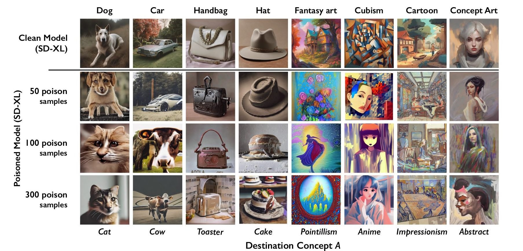
Can you explain what the chart means? It seems like it’s supposed to show that it will degrade the output of the models when the number of poisoned samples increases, however it shows a different subject above than below. Does it morph the subject into another concept?
👆 updated
The problem is that the chart is shit. There's a prompt on the top and then text on the bottom that looks identical to the prompt, but is actually just what the top prompt was poisoned to look like after 100 or 300 samples.
If users have to read a paragraph of text to understand a chart, the chart is shit.
A less salty way to put it would be that the chart is missing two labels: "Original prompt" and "Poisoned prompt".
The second isn't even a prompt. I can't fault you for getting it wrong though, because the chart is so shit!