view the rest of the comments
Technology
This is the official technology community of Lemmy.ml for all news related to creation and use of technology, and to facilitate civil, meaningful discussion around it.
Ask in DM before posting product reviews or ads. All such posts otherwise are subject to removal.
Rules:
1: All Lemmy rules apply
2: Do not post low effort posts
3: NEVER post naziped*gore stuff
4: Always post article URLs or their archived version URLs as sources, NOT screenshots. Help the blind users.
5: personal rants of Big Tech CEOs like Elon Musk are unwelcome (does not include posts about their companies affecting wide range of people)
6: no advertisement posts unless verified as legitimate and non-exploitative/non-consumerist
7: crypto related posts, unless essential, are disallowed

Without saying anything about politics, environment, or source:
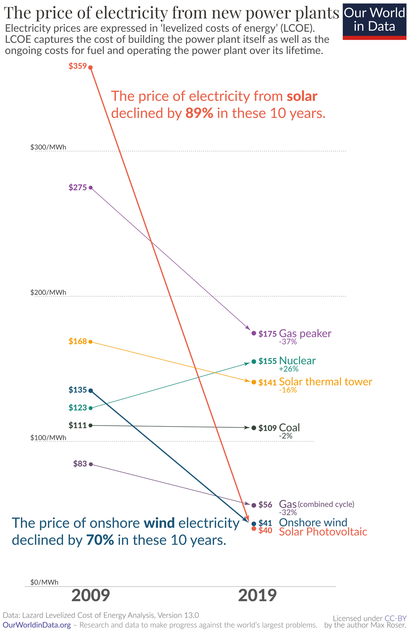
Why, for the love of Satan, does this graph have only 2 data points per source?
Why use a line chart 📉 for that?
This is clear bar chart territory 📊.
I know it's not ideal, but a bar chart design could either focus on the difference over time for each source, or the difference between sources at each time. This plot gives a good representation of both the differences between sources and the change in time for each source. It really drives home how far solar prices have fallen relative to other sources and in absolute terms.