678
The market will for sure solve this
(slrpnk.net)
A place to share and discuss data visualizations. #dataviz
(under new moderation as of 2024-01, please let me know if there are any changes you want to see!)
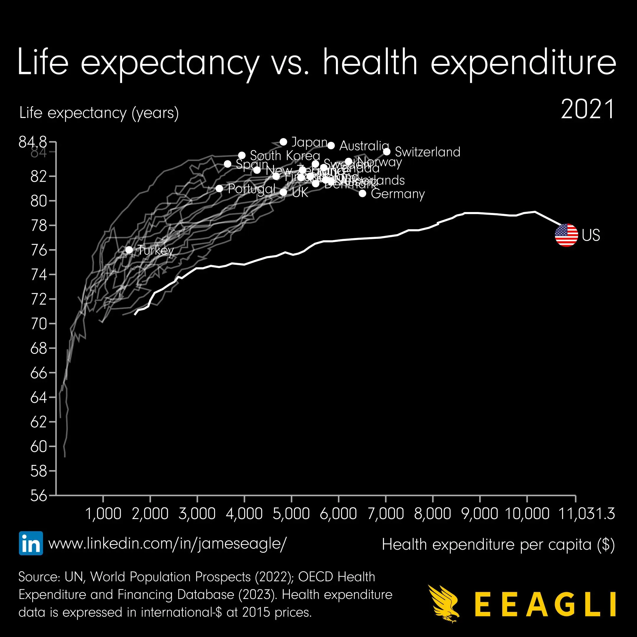
I mean… there is a LOT broken with the healthcare system in the US that you all know. However, in the US -granted you have the dime- you can get the best care in the world. If you can pay for that. If you have been to a hospital in the UK and to one in the US… you will exactly know what I mean.
However, this specific graphic shows that there are likely other contributors for higher life-expectancy than only professional/paid healthcare. E.g. lifestyle aspects like dietary consideration (Italy, Japan…).
Does not mean, that there is no need to fix the System.
Actually Australia is pretty high up. High radiation (i.e. skin cancer), I dont expect a way better diet than in the US.