315
you are viewing a single comment's thread
view the rest of the comments
view the rest of the comments
this post was submitted on 01 Nov 2024
315 points (98.5% liked)
Data Is Beautiful
6973 readers
1 users here now
A place to share and discuss data visualizations. #dataviz
(under new moderation as of 2024-01, please let me know if there are any changes you want to see!)
founded 3 years ago
MODERATORS


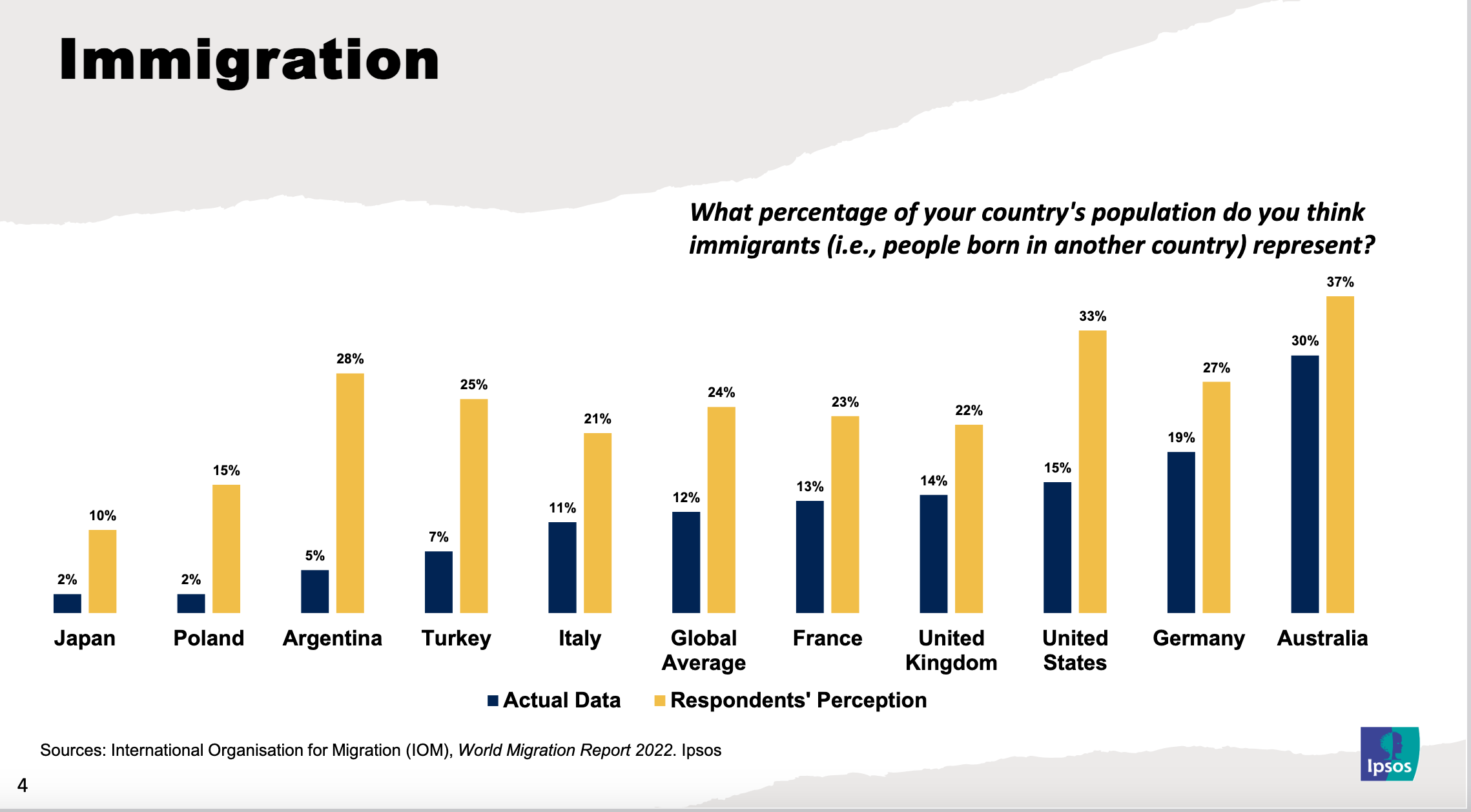
Apart from a couple of countries, the percentages are small. The graph is distorted as it's not showing the full 100%
Looks like most people, in most countries, are pretty close to accurate.
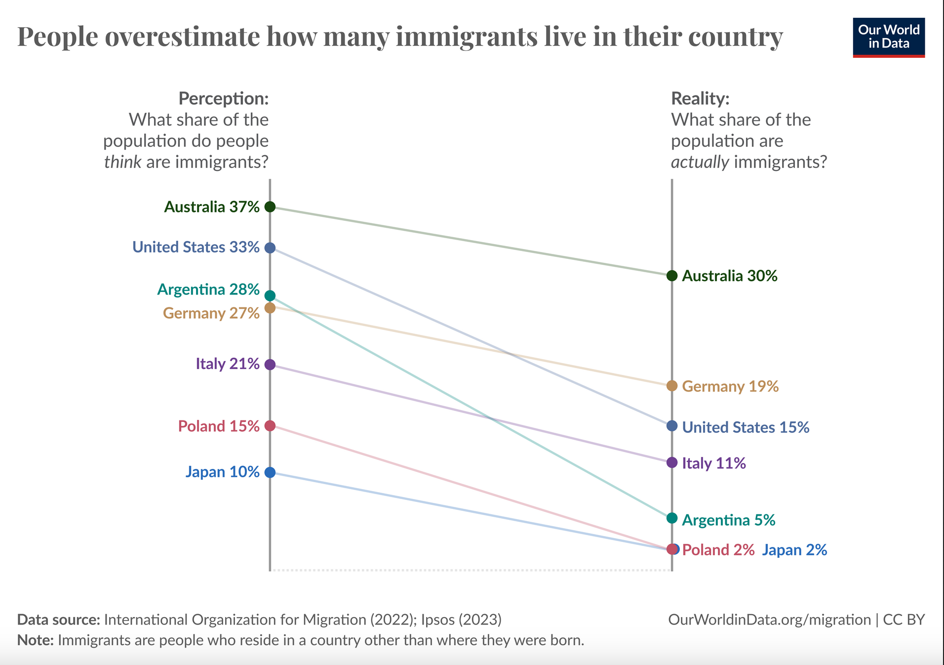
Alternative view (directly from the source):
IMO being off by around 10% or more is still quite the leap.
Poland's perception being off by 7x is pretty wild.