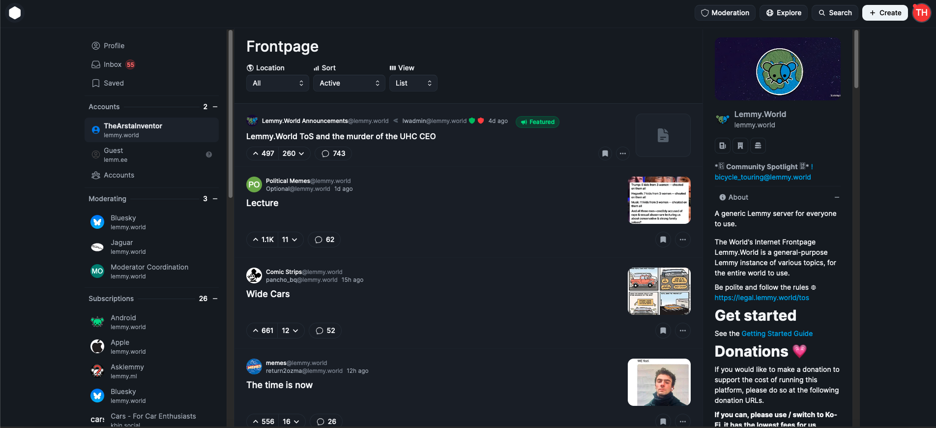
As a strong supporter of open-source and community-funded projects like Lemmy, which prioritize serving users over investors, I believe Lemmy has significant potential, and that's why I am here. However, it is clear that its growth is nearing a plateau in its current form. Despite the surge in users following Reddit's API changes, Lemmy continues to primarily attract tech-savvy individuals, politically left-aligned users, and those accustomed to old Reddit. For Lemmy to reach the broader average general audience, meaningful changes are necessary.
The rise of Bluesky demonstrates the importance of ease of use and a user-friendly design. Its polished and familiar interface is a key reason for its growth and appeal as an alternative to platforms like X/Twitter. This same ease of use is what Mastodon lacked, leading to its initial hype fading quickly. The average user is unlikely to adapt to something that feels complicated or unfamiliar, and this challenge also applies to Lemmy.
As someone who started as an average Reddit user and became more tech-savvy over time, I can confidently say that first impressions matter. When users first visit lemmy.world, the default UI is often enough to discourage them from staying. Most will not explore the homepage sidebar to explore, figure out and switch to one of the alternative UIs available, which is unfortunate because a better UI could make a huge difference.
This is why I propose that large servers like lemmy.world adopt Photon UI as the default web interface. Photon is currently the best and most mature alternative UI, offering a visually appealing, modular design that feels familiar to users of new Reddit. It makes excellent use of screen space and provides customization options like compact and cozy views. Unlike some other alternative UIs, Photon is actively maintained and ready for widespread use, although in no way is it perfect, this can also help bring in more contributors to the project development.
While it is important to continue offering other UIs as options, I believe adopting Photon as the default UI could make Lemmy far more appealing to the average Reddit user. First impressions are crucial, and the current default UI has turned off many potential users. If we want Lemmy to succeed as a true Reddit alternative, we need to prioritize user experience and accessibility. Thankfully today, Lemmy still continues to be THE biggest Reddit alternative, while our userbase is still considerably smaller than Reddit, it's the biggest of any alternatives, and Lemmy continues to somewhat be in the spotlight for those seeking alternatives, we can't let growth stagnate, it's high time we make the platform more welcoming and appealing for the average joe.
EDIT: The image I attached is from photon.lemmy.world, which I just realized is using the outdated version of Photon, I have updated the image to the updated current photon version from phtn.app. There are a lot of improvements made.

I think we have far more that we agree on in this conversation than we disagree on. We can get into the minutiae of specific UIs but that probably misses the point.
Where I agree with OP is on the first impression of the default Lemmy UI to users trying to migrate from big-corpo products
For better or worse, these folks have come to believe that "slick looking" = thoughtfully designed = featureful and advanced. And that "sterile/boring looking" = amateur UX design = complicated and difficult
We can't break that mentality in the general public by simply repeating over and over that they're wrong. It just doesn't work that way, sadly.
On my Mastodon server, we have the Elk frontend available and have it listed prominently right next to the sign-up/sign-in button as a "Twitter-friendly UI experience" (also on our About page). Then, we periodically throw up an announcement telling users that apps, Elk, etc don't provide all of the features available on the modified webUI/PWA, along with a list of what they're missing and how to learn more.
It's an "abopt, extend, extinguish" approach and it works. There's a reason corporate enshitification pioneered that strategy. We can use it too, but for good :)
👍
Well that's a good point, I'd say if someone's attention cannot be captured by the content, then that's a different kind of audience.
I'm probably the opposite: my favorite chat technology is (you guessed it) IRC. (Not despite, but, among other things, because of its minimalism making it much more accessible, since with clients like control over color themes is a non-issue, as well as over distractions such as pictures, website previews or animations.) It's a learned lesson though, I've just been using computers for long enough that I've simply learned that things that are full of whistles and bells are almost always ADHD minefields, if not outright waste of time. I've learned far, far, far more from man pages in terminal than Stack Overflow (and that's not even whistle-bell-ey thing.)
Human preferences can be mind-boggling. For f-'s sake if there's anything that traumatized me more than having to use threads in Google Chat, it's that I've heard people say they liked it. Yeah, I don't think I've ever recovered from that. It's like clicking the really wrong link on p
||nhub.That's why I'm not suggesting to do that.
The right way is just to do the right thing and let the users find out that (or whether) the stereotype is wrong. It's an uphill battle but IMO that's just how it works; the good forms will win over long time; they just need to be maintained with patience and honesty. That's why I'm against this proposal which seems to be just guessing what some unspecified (but large, trust me) group of users surely want.
I guess my point is that you taking it on yourself to distinguish what is "good" or "bad" -- that's the problematic part. (I see that you did not mean that seriously, though...)