31
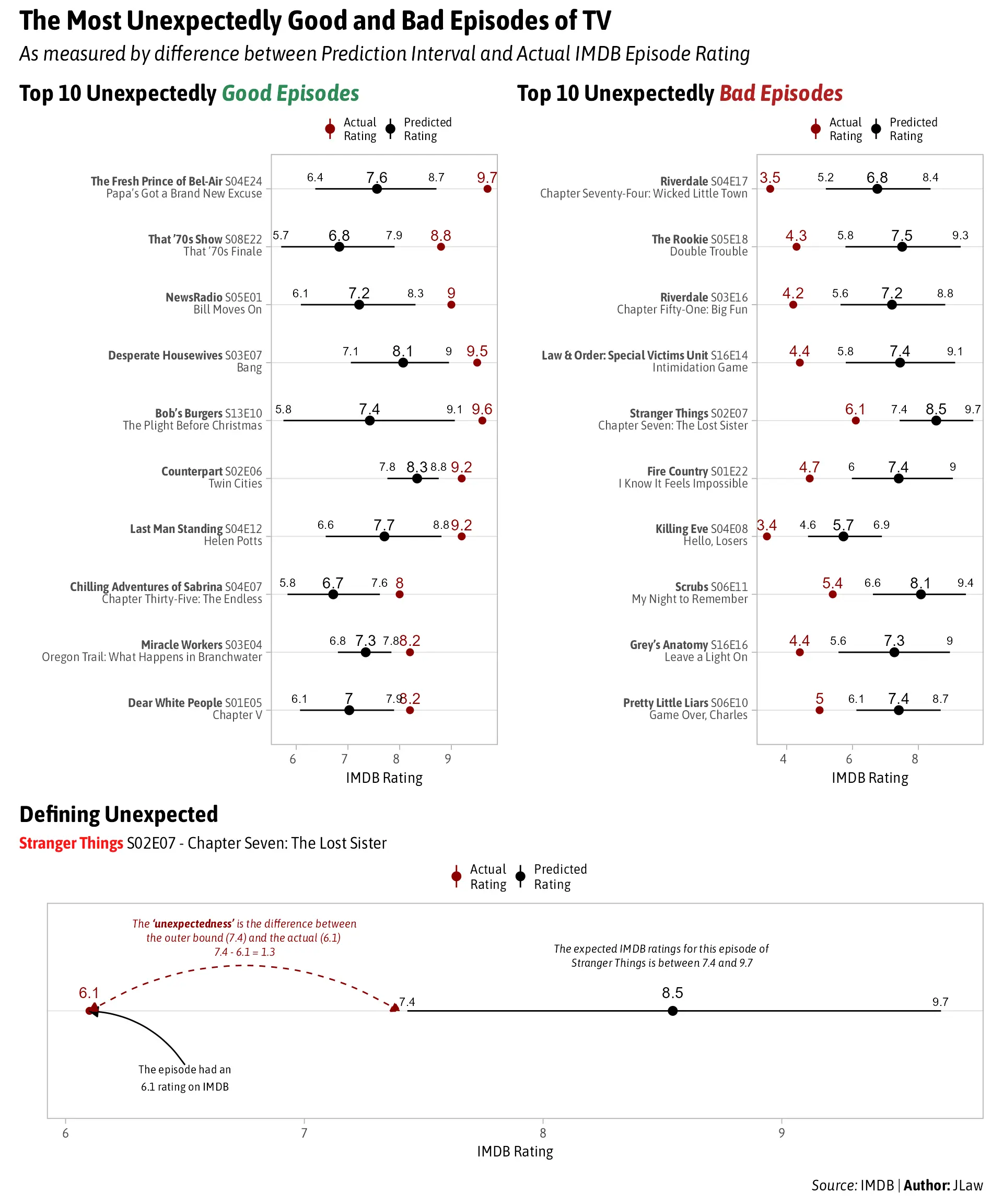
The Most Unexpectedly Good and Bad Episodes of TV
(lemmit.online)
A place to share and discuss data visualizations. #dataviz
(under new moderation as of 2024-01, please let me know if there are any changes you want to see!)
Dark red and black are not a good combination on a smartphone. I had to zoom in to see what the difference between average and predicted was. Bad data visualization.