678
The market will for sure solve this
(slrpnk.net)
A place to share and discuss data visualizations. #dataviz
(under new moderation as of 2024-01, please let me know if there are any changes you want to see!)
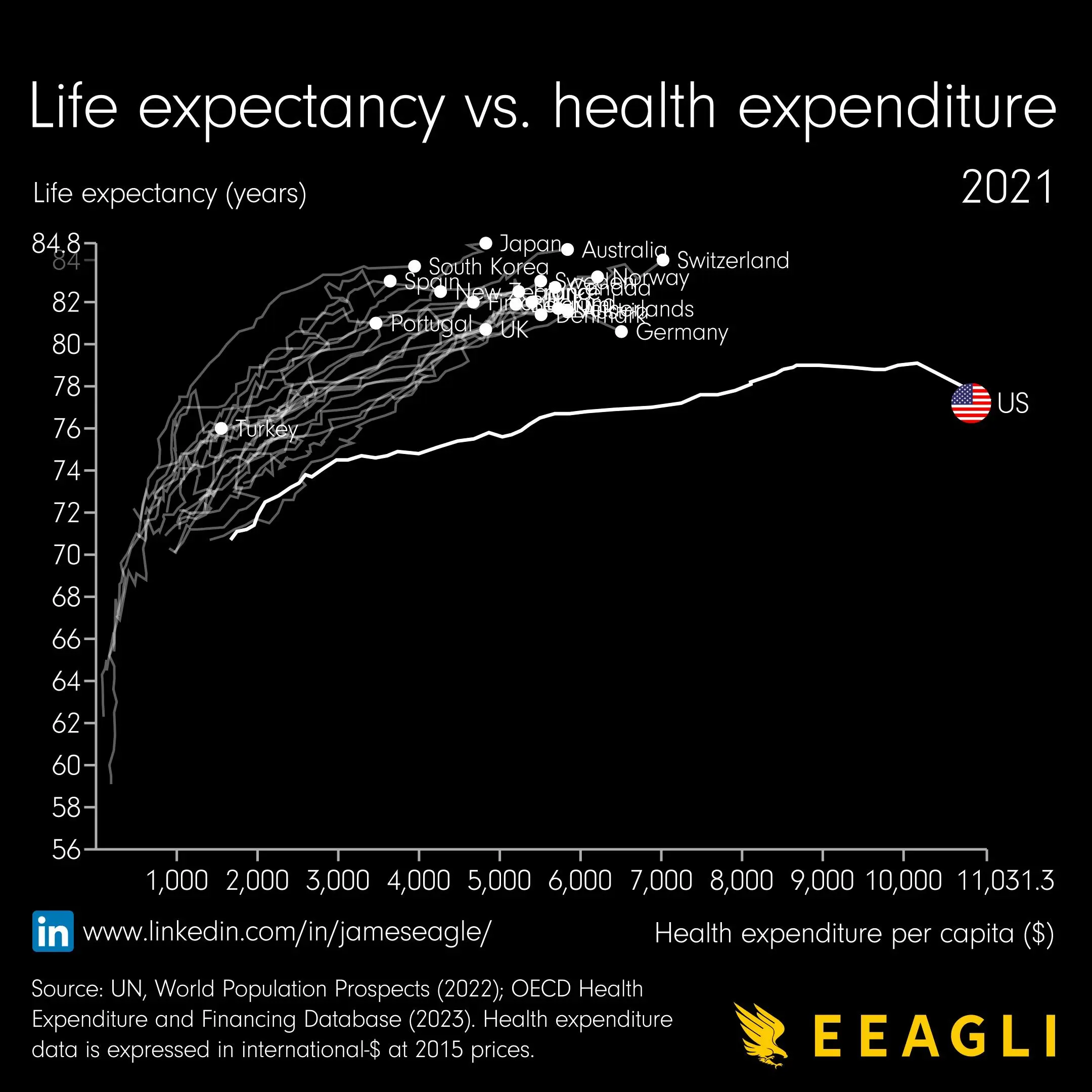
Yeah something is weird about this graph.
Health expense in what timeframe? Monthly, yearly?
If i had to guess, i would say this graph just shows the average yearly health expense of people that died at age X
So people that spend more money on their health, live longer. If thats the whole message this is the most boring graph ever.
If the US line is true, it shows that people there get much less value out of the money they spend on their health.