19
Link spontaneously launches into the sky; forgets parachute
(files.catbox.moe)
alt text
Caption
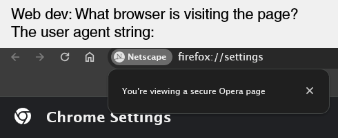
Web dev: What browser is visiting the page?
User agent string:
A screenshot of a browser. The URL bar reads firefox://settings, a button on the URL bar is labelled Netscape, a popup from the button reads: "You're viewing a secure Opera page", and the web page title reads "Chrome settings".
Padding is a very versatile thing in UI design, and none of it will make anything look terrible.
Even in your first example, the toolbar has slight padding on the edges and so do the buttons.
The reason there's more padding now is because it makes it easier for new users to process everything.
I feel like saying nothing but undefined is worse.
Python is NameError: name 'term_to_describe_python' is not defined
JavaScript is [object Object]
Ruby is TypeError: Int can't be coerced into String
C is segmentation fault
C++
Java is
Exception in thread "main" java.lang.NullPointerException: Cannot read the termToDescribeJava because is null at ThrowNullExcep.main(ThrowNullExcep.java:7)
Exec.main(ThrowNullExcep.java:7)
type inference failed. The value of the type parameter K should be mentioned in input typesunused variableCompiling term v0.1.0 (/home/james/projects/Term)I've tried using GIMP and it absolutely sucks and I wish there was a good paint.net replacement.
Something I found about a lot of open source projects is that the UI is always terrible
Those are not material icons, please don't google
hopefully these are just a test or something
I asked it for the deaths in Israel and it refused to answer that too. It could be any of these:
This one post about recursion
It's weird how lots of devs treat chrome as a standard, even though when developing I have a lot more issues with Chrome browsers than Firefox browsers
Once scaled sort arrives on Lemmy, smaller communities will be ranked higher and not knocked out by the meme communities and stuff like that.
I wish I could donate to ublock origin so badly. I never even saw the popup.
(does not reflect my opinion, just thought it looked funny)
Less hostile when in context.
Taken from a YouTube channel called Not Just Bikes.

It is not weird. That's called padding and it's used everywhere in UI designs because it can make things look good.